Tips for better typography
There is no escaping typography. It's everywhere and a large part of every product you use. Getting typography right is therefore a huge part of making something look and feel professionally designed. Here are some simple tips to keep in mind when you’re working with typography.
Be bold with contrast
Contrast is the most consistently important design fundamental. Make sure to avoid minimal differences in typography for visual designs, like on websites and posters. This includes weights, sizes, and different font families.
If you’re using different weights for a title and a paragraph, an example would be to use 400 and 700, not 400 and 500. For variation in sizes, I would advise doubling the size between emphasized text like headers and associated body text. High contrast is decisive. Small contrast is arbitrary and boring.
Notice the contrast in font sizes between the main heading, list items, and paragraph text on this example poster for Vercel's Geist Typeface. Each is about half the size of the last, creating a clear hierarchy and visual contrast.
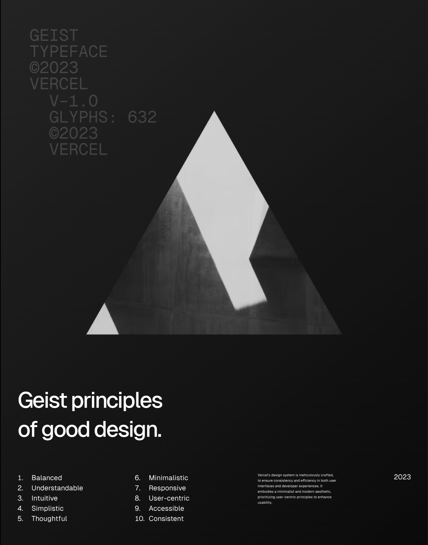
Contrast on a Poster
There are of course exceptions depending on the use cases. Like on blogs (like this one), where many large headings can be overwhelming, you might want to use a smaller contrast and compensate with color or weight.
Pay Attention to Leading
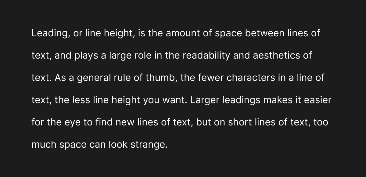
Leading is the additional space inserted between lines of text and plays a large role in the readability and aesthetics of a design.
Leading is similar but different to line height, which is how much vertical space each line of text takes up. Line height helps to specify the amount of leading which can be expressed as a ratio of the line height to the font size. For example, if the font size is 12 points and the line height is 18, the leading is 1.5.
The longer a line of text (as in the number of characters) the more leading it needs. With long lines, where your eye has to travel a long distance to find the next line, a larger leading is important for differentiating each line and for the eye to find new lines of text. A good rule of thumb is to use a leading of about 1.5 - 1.9 for body text about as wide as a book page.
This also means shorter lines of text require less leading. You need to be careful here because a large leading used on short lines of text makes each line appear as an individual element rather than a coherent block of text. For example, lines of text with only a few words rarely need more than around 1.3 leading. Large leadings on short lines of text are a quick giveaway of amateur design.
With that said, leading also plays a large role in the style of a design and should support the desired aesthetics. A small leading makes a design more dense and containerized, making each block of text a coherent element. This is great for sites like Palantir with an industrial aesthetic.

1.4 Leading Paragraph from the Palantir Website
A lot of leading makes a design more airy and open, with each line of text starting to look like an independent element of the page. Think about the type of design you want to create and adjust the leading accordingly.
Large Leading (2.1)
Adjusting Tracking and Leading for Headings
The tracking of a font, or the standard space between characters, is usually optimized for a standard reading size of around 16px. When you blow that text size up for large headings the tracking is often wide and the headings don’t feel clean. I usually drop the letter spacing to around -0.03em for large headings. Play with this value depending on the heading size and the font until you get something that looks right to you.
Headings also generally demand less leading because default line heights are optimized for standard body size text. For example, here is a default heading:
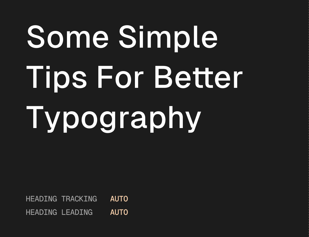
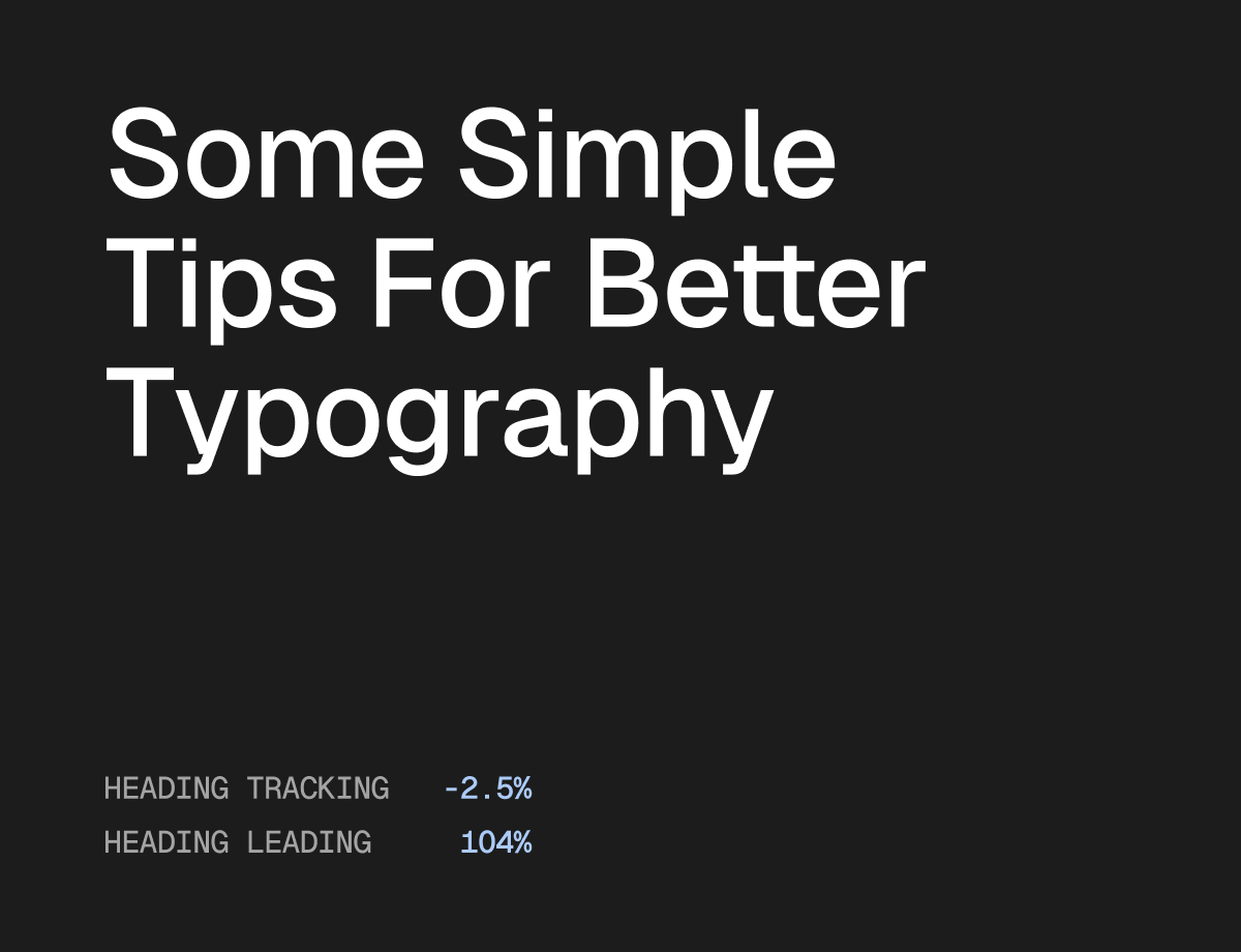
The individual lines of text are so short and the leading is so large that each line looks like an independent element. This can work for a variety of styles but this is rarely what you want and also a quick giveaway of amateur design. Here is an adjusted heading with reduced tracking and leading so the lines of text look like a coherent block:
Choosing the right font
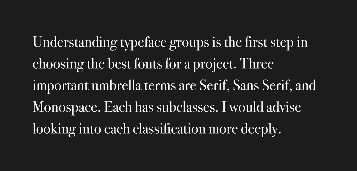
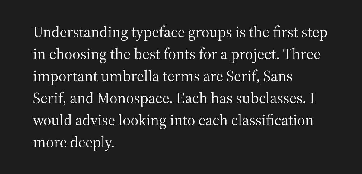
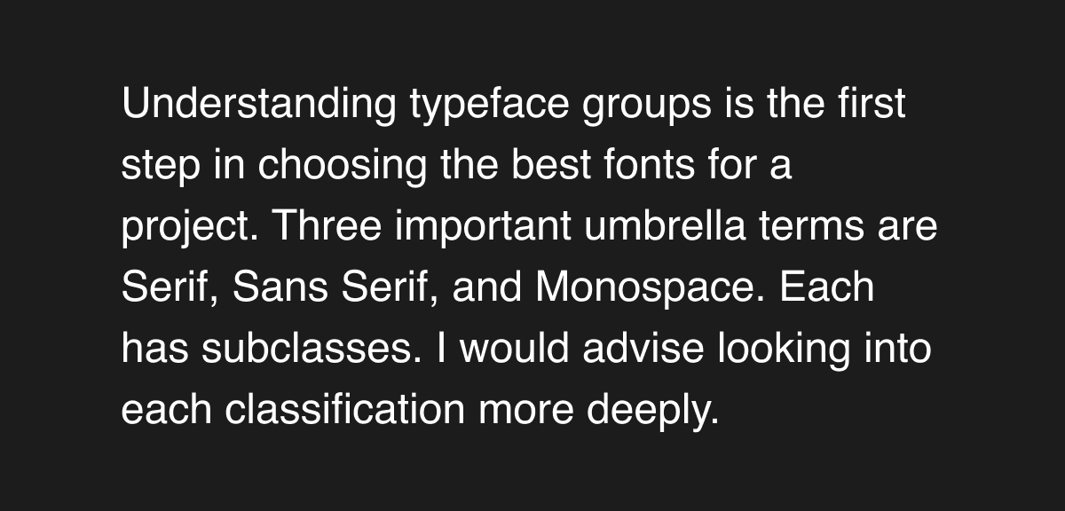
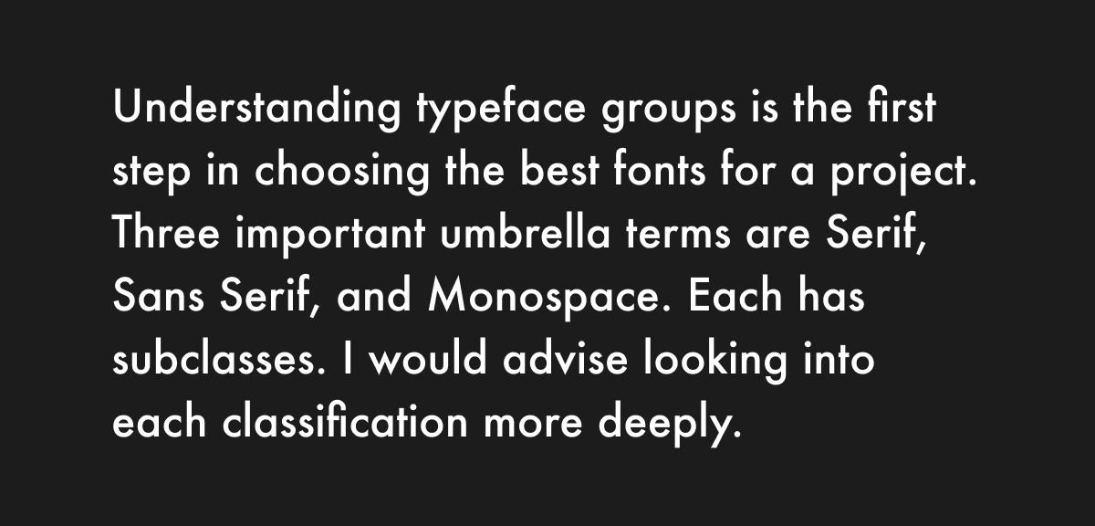
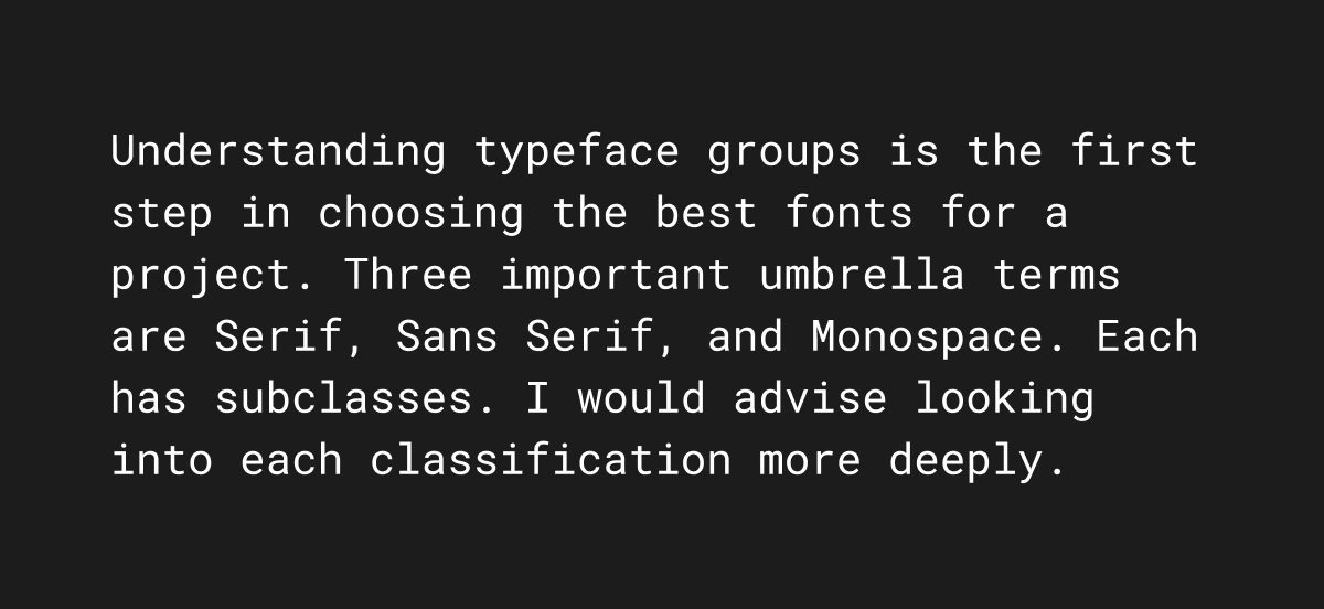
Understanding typeface groups and the styles they suit is the first step in choosing the best fonts for a project. Three important umbrella terms are Serif, Sans Serif, and Monospace. Each has subclasses. Here I’ll just give a general overview but I would advise looking into each classification more deeply.
Serifs
Serifs have, well, serifs. They are the tail-like accents on characters. These are generally more traditional and professional. You’ll find these fonts used in a lot of traditional brands where trust is important, like banks. They are also used for the body text of most long books because some serif fonts can be particularly easy to read at small font sizes because of their accents.
Two subclasses to know are Modern Serifs and Humanist Serifs. Modern serifs have very high stroke constrast and thin, blocky serifs.
Bodini, a Modern Serif
Humanist Serifs have less stroke contrast and more closely resemble human handwriting.
Source Serif 4, a Humanist Serif
Sans Serifs
As per the name (sans is French for without), these are fonts without serifs. This is the typical font style for most websites and apps. They are generally more modern and clean. Two subcategories are Transitional Sans Serifs and Geometric Sans Serifs.
Transitional Sans Serifs have some cursive elements like more subtle stroke contrast and a tail on the lowercase a.
Helvetica, Transitional Sans-Serif
Geometric Sans Serifs are based on geometric forms like circles and triangles. Letters like v more closely resemble a triangle and the o is a perfect circle. They convey a very modern and industrial aesthetic.
Futura, a Geometric Sans Serif
Monospace
Each character in a monospace font is the same width. This makes them great for counters, clocks, and tables — or wherever width needs to be maintained across varying characters.
Roboto Mono
Some sans-serif fonts even have a superfamily that includes a matching mono font. Geist designed by Vercel is an example of this, being broken into Geist Sans and Geist Mono.
Now that you know the basics, take these classifications and try to identify the fonts you see in the world. Pay attention to what style of brand they're used with. This will help you understand when best to use each style and what values they convey.
Contain Paragraph Widths
Sometimes called the measure, the width of a line of text is one of the most important but simple considerations. Long lines of text are tiring to read and generally look unprofessional.
A good rule of thumb is to set a max width of around 75 characters. Take a look at any book, popular website site, or newspaper and you’ll see this rule in action.
Here each line has 120 characters, which is usually too many:
Let's tighten this up a bit. Here each line has 69 characters:
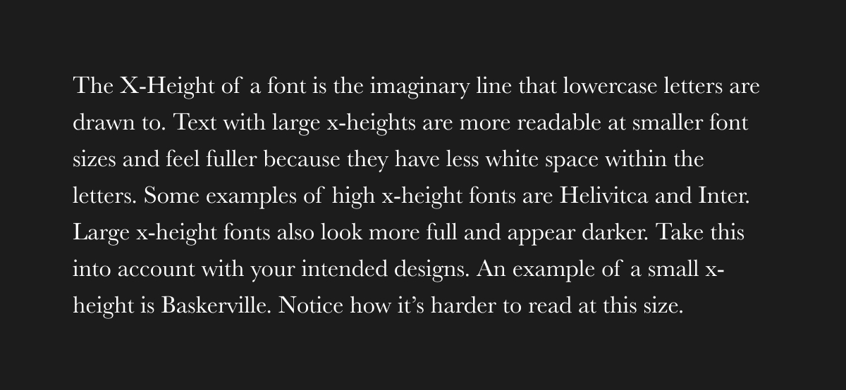
Small text needs large x-heights
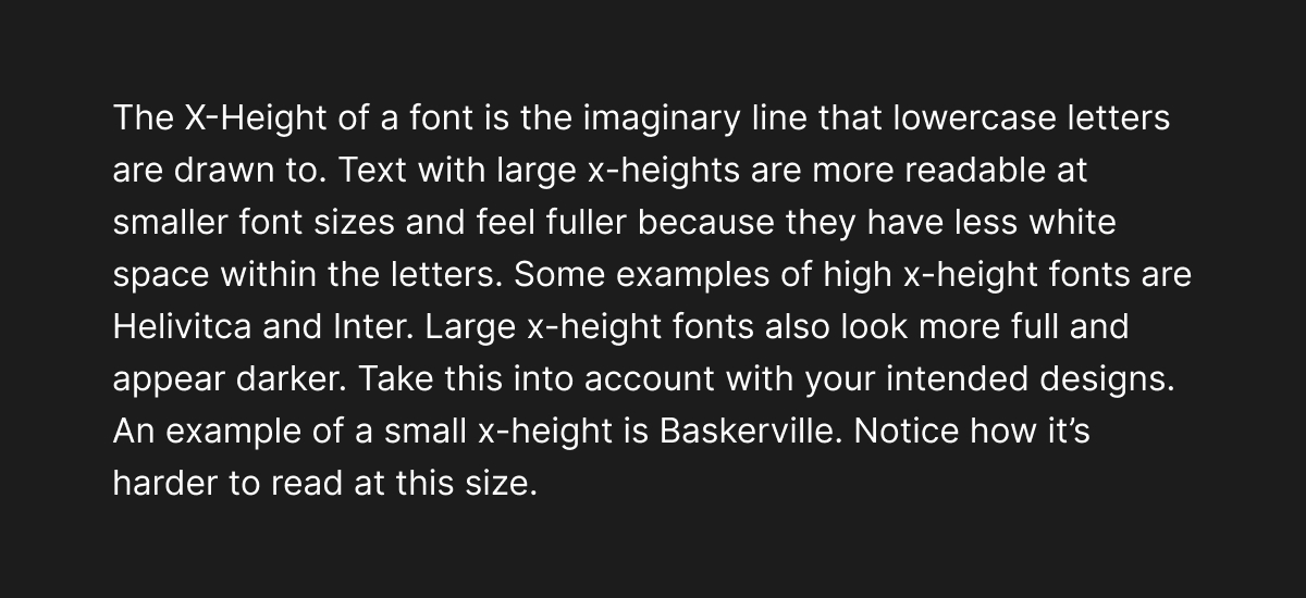
The X-Height of a font is the imaginary line that lowercase letters are drawn to. Text with large x-heights is more readable at smaller font sizes and looks fuller because characters have less white space.
Some examples of high x-height fonts are Helvetica and Inter. Large x-height fonts also look more full and appear darker. Take this into account with your intended designs.
Inter has a large x-height
An example of a small x-height is Baskerville. Notice how it’s harder to read at this size than Inter. Small x-height fonts are generally intended for headings and larger text.
Baskerville has a smaller x-height
Don’t tolerate orphans
Orphans are single words or a very short last line of text of a paragraph. It’s easy to account for these in static designs with subtle size and wording changes.
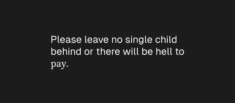
Don't do this. Especially for headings!
For responsive designs like on websites, you can use CSS properties like text-wrap: pretty on important lines of text like headings to force better text balance. This is a pretty slow algorithm and doesn't work on long paragraphs so use it only when needed.
Resize me and see that no single word will ever be left hanging after a much longer line!
Lighten up paragraphs
If you spend a lot of time looking at websites you might notice that paragraph text colors are rarely fully black or white. They are usually an offset of about 70% opacity. This makes long text softer on the eyes and easier to read.
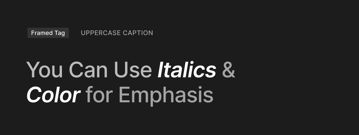
Use Various Heading Styles
To create more contrast in designs, a standard list of styles you can apply to text to build contrast are:
- Uppercase captions
- Framed captions or tags
- Italics for emphasis
- Color offsets
Use "&" Appropriately
Use ampersands for headings and text where space is limited, like captions. Use and in paragraphs where space is more freely available. Don't use & in body text.
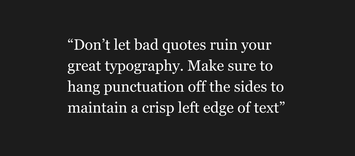
Hang punctuation
This one is simple. Make sure you hang your quotes so they don’t eat into paragraphs and leave unappealing white space.
Quotes disturb crisp left-edge (Bad)
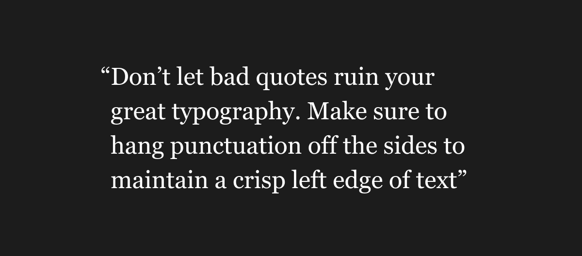
Quotes hang off the edge (Good)
Make use of non-lining numerals
A lot of people are surprised to learn there are two different figures for each numeral in a lot of fonts, particularly in serif fonts.
One type is called Lining Numerals which is the type most people are familiar with. They all are mono-spaced so they take up the same width and are the height of capitals. They were developed so tables of numbers took up the same width.
The second type called Non-lining Numerals (sometimes called Old Style) are variable width and sometimes descend below the baseline.
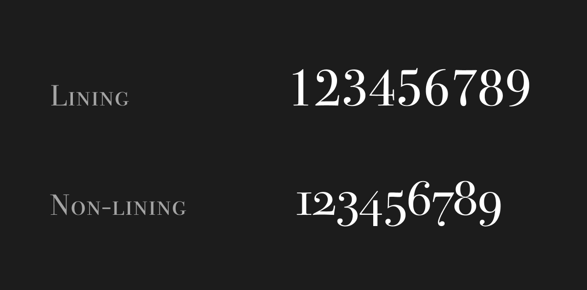
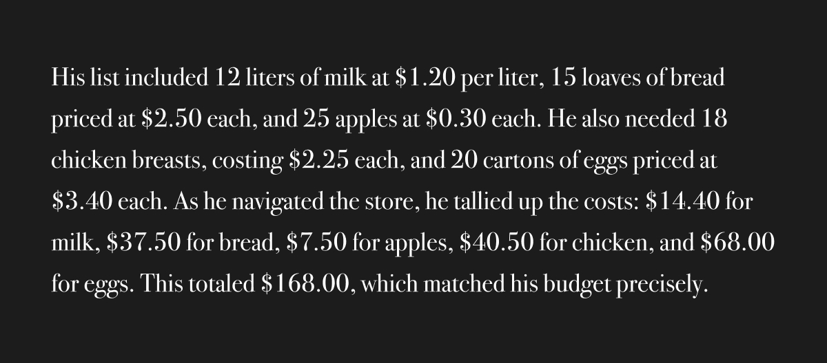
Lining numerals can look quite invasive in running text, especially if a lot of numbers are used. For example:
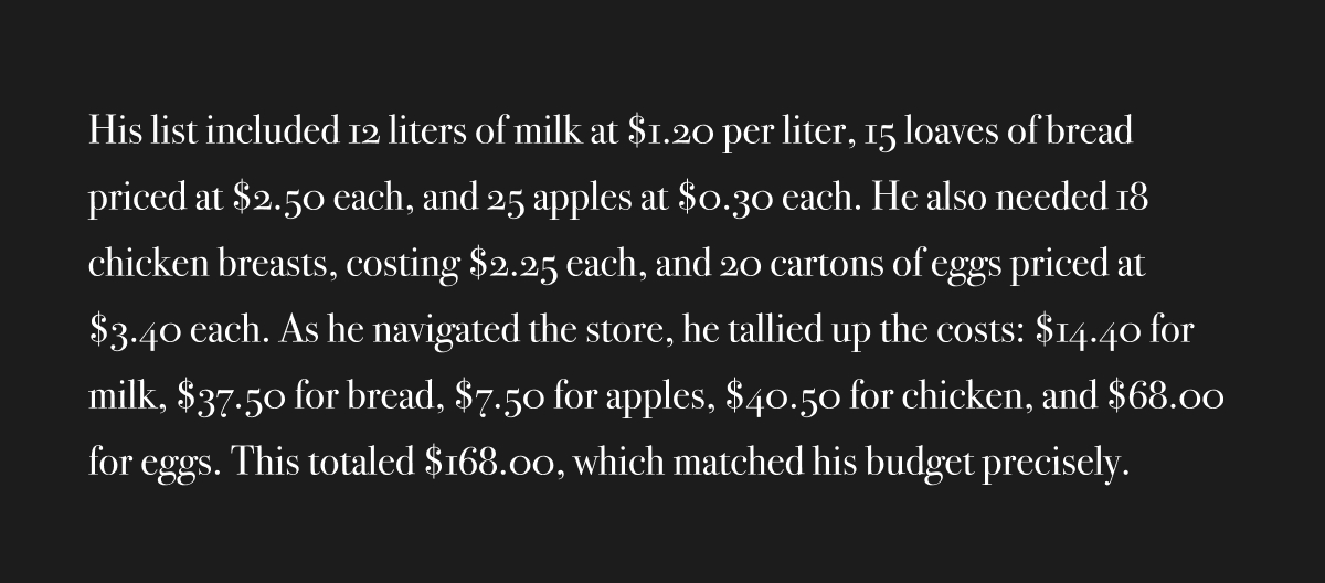
Non-lining numerals generally look better in running text like the characters are less intrusive and look more organic. For example:
Thanks for reading and I hope you’ve found some of this helpful. If you want to chat further, you can connect with me on X.